Derived from the feminine given name, traditionally of primarily Scottish usage, meaning name of two Scottish Rivers, Isla is a soft, delicate pastel green.
The creamy, off white with pink undertones of Darcy makes it a luxurious choice. Creating a light, silky finish, Darcy compliments any modern interior.
Fresh and cool, Pool Deck brings a fun, yet muted tone to your walls. Fresh and exciting, like the feeling you receive when seeing a glimpse at the pool on holiday, this shade is the perfect balance of red, green and blue, creating a soft liveable shade.
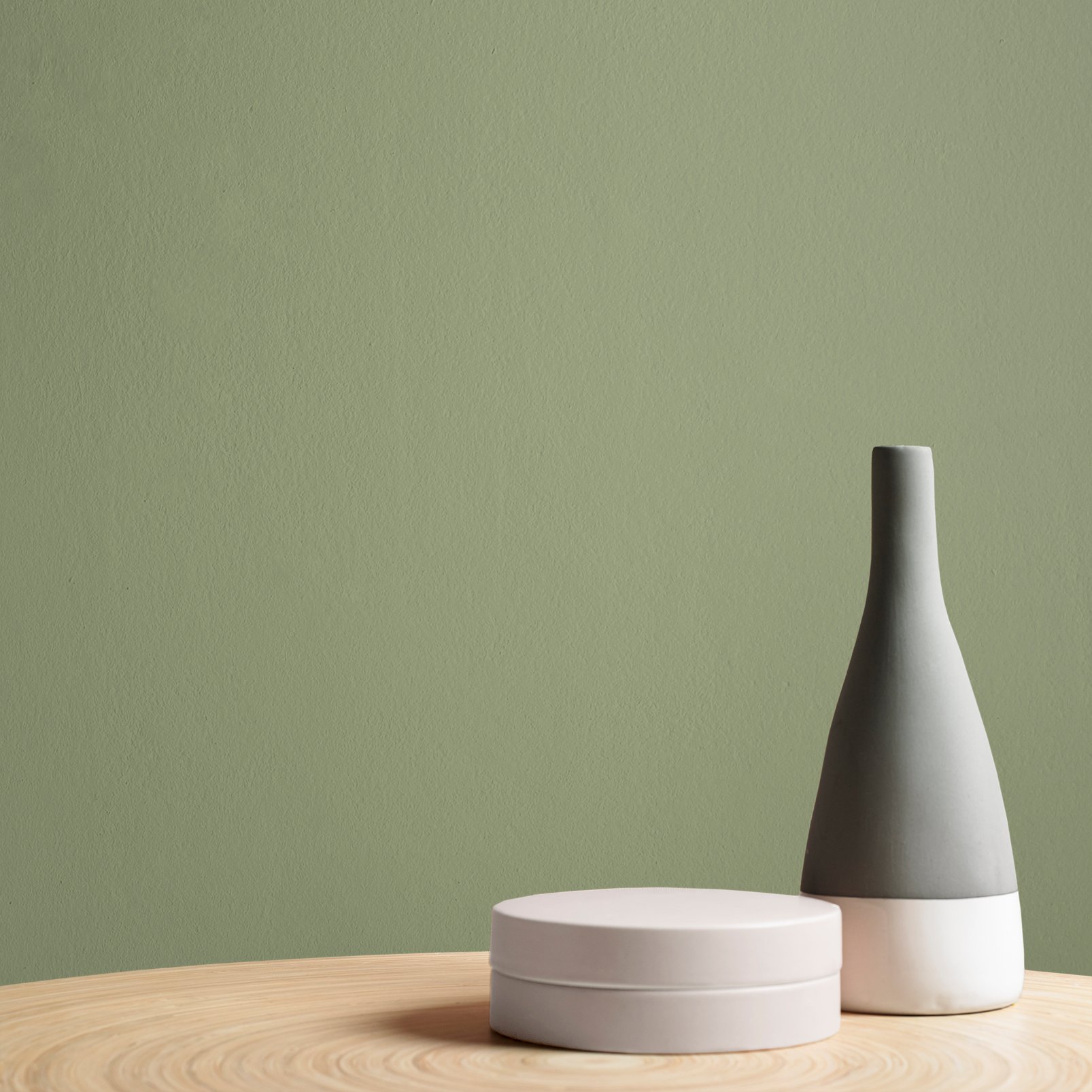
Whirl is a contemporary, liveable sage green. This gorgeous, soft colour works within a modern setting, or a period style home. It can be styled in a cosy, nostalgic manner or a modern haven.
Native to East Asia, the Balloon Flower is fresh purple flower, inspiring this stunning paint colour. This beautiful purple paint is ideal for creating a regal atmosphere.
Burnt Saffron is the perfect muted, moody mustard with an oriental incentive. This regal, impacting shade will create depth and dimension on any wall it is used on.
Fetish is an intense shade, with red undertones. When used in a well-lit room, Fetish will read as a deep brown shade, but in lower lighting, it will be almost black.
With a subtle hint of silver colour to lift this white based neutral. Laura Ashley paints are high quality water based paints created using the richest pigments for depth of colour and even results. Our paint collection beautifully complements our wallpaper ranges.
Ethos exudes distinctive, bold character. Rich, deep and interesting, this blue grey is classic and will give a timeless finish in any room in your home.
Bikini - a fun, summery raspberry shade of pink! This beautiful pink will bring the freshest tones to your walls, with red and small glimmers of blue pigments. Freshen further with peachy tones of Aloha to create an exotic fun decor or tone with Glass Heart for a contemporary feel.
The deep, rich and moody tones of Trouble create the most magical depth wherever it is used. Trouble combines the deepest blue pigments, with hints of black colourant, to ensure an intense tone.
Another tone of green to add to the collection but this time with a tone of importance. State room adds an element of sophistication inspired by the grand rooms in spome of our favorite historical buildings. Compliment with our warming neutral 'London Bridge' across oyur trim and ceiling. A brilliant white could cool down this authoritive green.
Perfect for creating a fragrant atmosphere in your home, Turmeric paint brings the warm glow of Indian sunshine to your living space. Create an overall contemporary look by styling this paint with grey furnishings.
Plover, named after the widely distributed group of wading birds, and their distinctive soft, tonal neutral feathers. Bringing the slightest hint of grey, Plover is versatile and understated. Used in brighter, south facing rooms, Plover takes on a soft, fresh feel. Whilst used in older, darker style décor, Plover becomes a more traditional neutral.
Let relaxation take over when using Panache. With green being all the rage, invite in this playful shade to your decor. With Panache being the perfect midtone green, it will elevate even the smallest space, into a hub off tranquillity.
Botanico, Italian for Botanist, describes this tropical shade perfectly. With a combination of blue and green pigments, this vibrant colour is perfect for a striking décor.
Sweet and mild Pimento is the perfect peppery red to add a little heat to any decor. Rich in colour with its orange undertones Pimento will bring joy and warmth into your room. Cool things down when paired with our pressed powder paint.
Ginger Lily brings a gentle warmth to any room. Delicate and decadent, this shade is perfect for brightening up any room, whilst still bringing warmth, to create an inviting atmosphere.
Soft, liveable, dusky pink hues of Hippie make this easy living colour tie in with a wide range of G & B wallpapers. Hippie, taken from hues within wish Lilac Grey wallpaper, this beautiful paint is looks slightly lilac in darker lit rooms, and works beautifully to add a liveable colour.
Create a cosy and inviting space by using this deep grey with green undertones. Herbert is a great choice for West or South facing rooms as it will help to neutralise the warm, direct sunlight and in this space will read as a truer grey. It's also a fantastic addition to green, tonal schemes if you're looking to add depth with a darker colour.